
A Touring Orchestra Gets an Identity Built From Music, Not Architecture
Amsterdam studio Thonik designed an identity for the touring Phion Symphony Orchestra grounded entirely in typography, using a variable-slant typeface that shifts with each concert's mood.
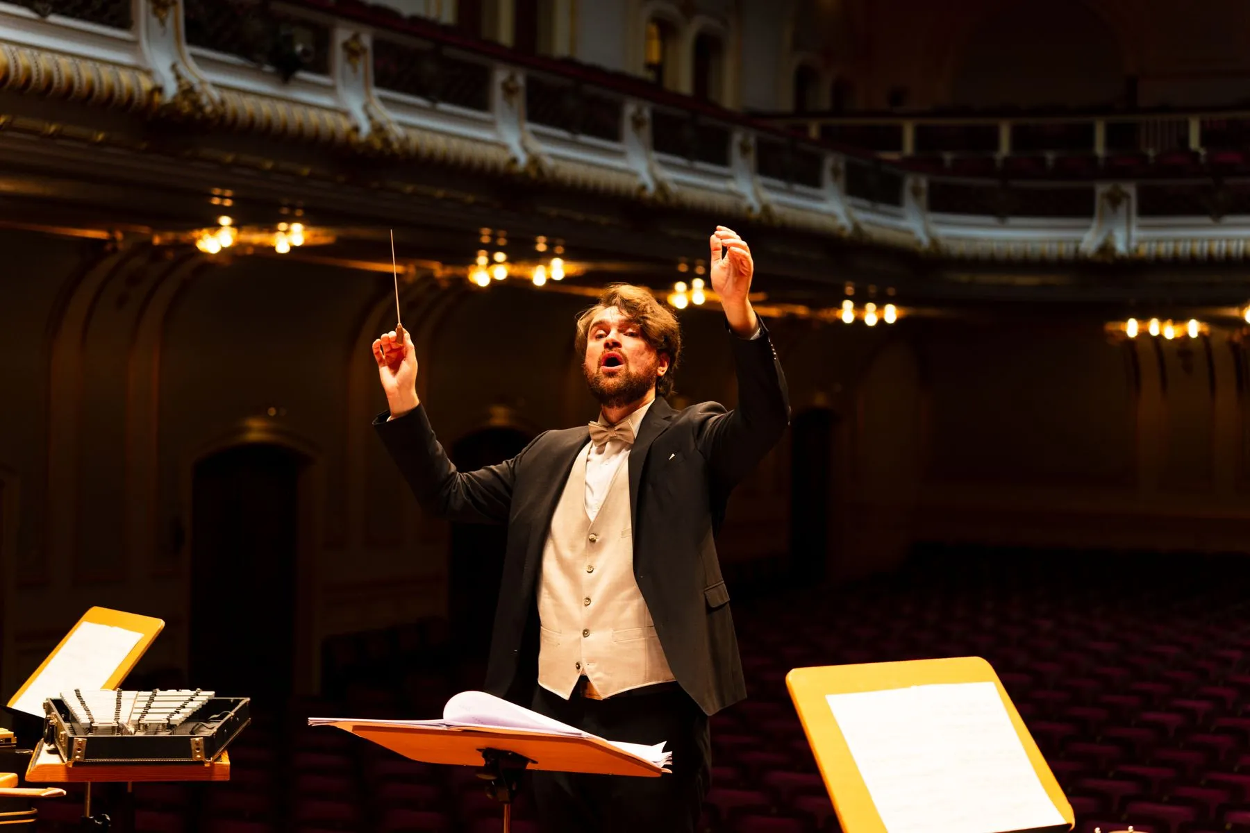
Most orchestras anchor their visual identity to a concert hall, a piece of architecture, or a city's history. Phion Symphony Orchestra has none of that: it's a touring ensemble with no fixed home. Amsterdam-based Studio Thonik built an identity that fills that gap with typography instead.
Falco van Burg, design lead at Studio Thonik, explains that because the orchestra has no recognisable building or place, the studio chose to make music the foundation of the identity rather than architecture. The system was built to expand with every concert while staying recognisable to audiences.
At the centre of the identity is GT Planar, a variable-angle sans-serif from Swiss foundry Grilli Type with a continuous slant axis spanning a full 90 degrees. Van Burg notes that the typeface reveals extra forms only when tilted, details that emphasise its character and suggest the type designer knew exactly how the letters should move.
The design process for each concert starts with the same questions: is the piece calm or restless, does it build slowly or hit immediately? According to van Burg, a restless piece bends the letters hard and breaks the word apart, while a calm piece stays open and quiet.
The result is a flexible system, backed by a series of animations, that lets the orchestra produce a different visual tone for every show while remaining identifiable across none of them sharing a single venue. It stands out as an attempt to generate a sense of place through typography alone, without leaning on a building or a fixed logo.
Credits and sources
Source
- It's Nice That · 26 August 2026
This piece was written by 2C Magazine from the facts in the source above. No sentences were taken or translated from the source; the commentary is our own.
Image
Illustrative image · Photo: Jonas Baumann / Pexels — free licence
The image is not the subject’s own photograph; it was chosen from a free-licence archive to represent the topic. No image from the source publication was copied.
Copyright
Text © 2C Magazine, 2026. You may quote with attribution and a link; republishing in full requires permission.
hello@2cstd.com — notices are actioned within 48 hours.
Comments
Loading comments...