
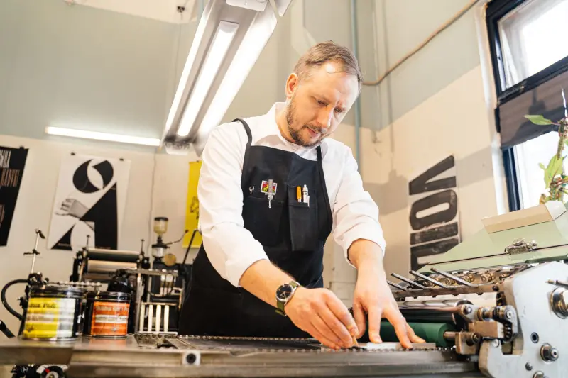
A Third-Generation Print Shop Gets Nine Logos Instead of One
Designer Laura Clink built a flexible identity system around nine interchangeable logos for Phillips Print, a third-generation family-run printer near London, rather than settling on a single fixed mark.
Read →
When a Typeface Becomes a Character: Charlotte Rohde's Oficía Mono
Berlin-based type designer Charlotte Rohde has turned a font experiment abandoned years ago into Oficía Mono, a released typeface that has since become the protagonist of her forthcoming novel.
Read →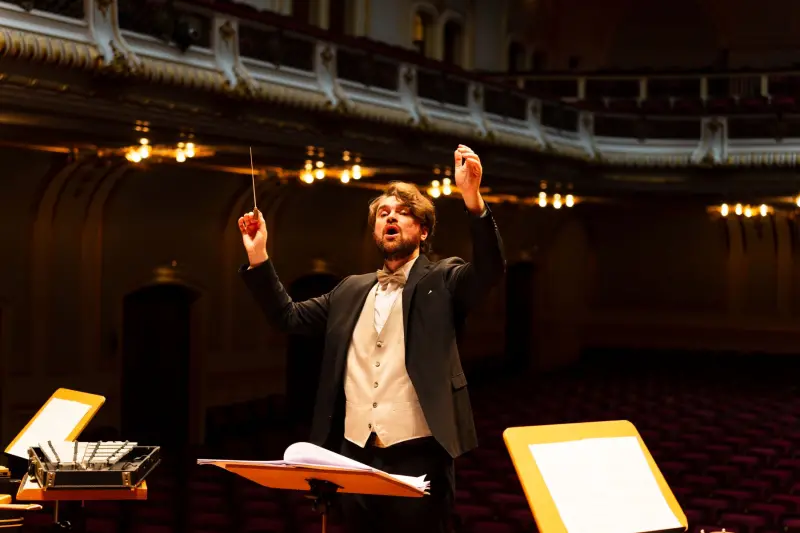
A Touring Orchestra Gets an Identity Built From Music, Not Architecture
Amsterdam studio Thonik designed an identity for the touring Phion Symphony Orchestra grounded entirely in typography, using a variable-slant typeface that shifts with each concert's mood.
Read →
Instagram Redesigns Its Wordmark for the First Time in a Decade
Meta has refreshed Instagram's wordmark, unchanged since 2016. The new logotype and a three-typeface brand system will roll out gradually worldwide through 2026 and beyond.
Read →