
Berlin Museum's New Identity Comes From the Street
Stan Hema built a flexible wordmark for the rebranded Stiftung Stadtmuseum, drawing its typography from U-Bahn signage and currywurst kiosks rather than the archive.
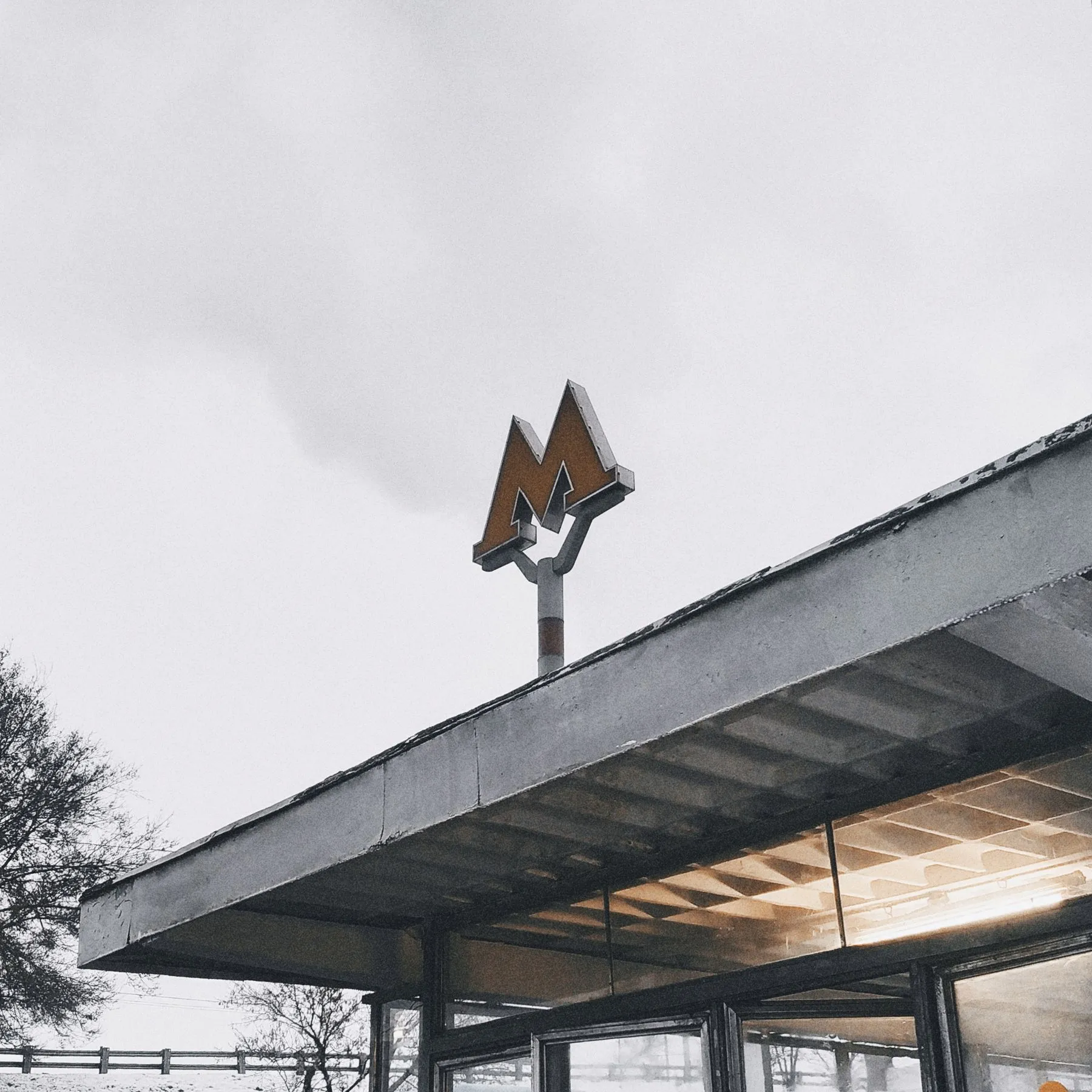
Stiftung Stadtmuseum has repositioned itself as Berlin Museum, with a visual identity by Stan Hema. At its centre is a flexible wordmark that changes shape according to context rather than locking into a fixed logo. The typographic references are not drawn from the collection but from the city outside it: U-Bahn station signs and the lettering on currywurst kiosks. Forms nobody files under design, and everybody recognises.
The choice is practical as well as rhetorical. The foundation runs several venues, and a single fixed mark tends to fracture across them as each site invents its own variant. A variable typographic block holds the family together at different scales, locating consistency in behaviour rather than in a symbol. It also reframes what a city museum is for: not a keeper of the past speaking in archival type, but an institution using the same language as the street it sits on.
Credits and sources
Source
- It's Nice That · 6 August 2026
This piece was written by 2C Magazine from the facts in the source above. No sentences were taken or translated from the source; the commentary is our own.
Image
Illustrative image · Photo: mxkrv / Pexels — free licence
The image is not the subject’s own photograph; it was chosen from a free-licence archive to represent the topic. No image from the source publication was copied.
Copyright
Text © 2C Magazine, 2026. You may quote with attribution and a link; republishing in full requires permission.
hello@2cstd.com — notices are actioned within 48 hours.
Comments
Loading comments...