
A Typeface That Human Eyes Read and Machines Misread
Mixfont's Decoy Font layers crisp letterforms over blurred background shapes, keeping text legible for people while confusing image models trained to parse it.
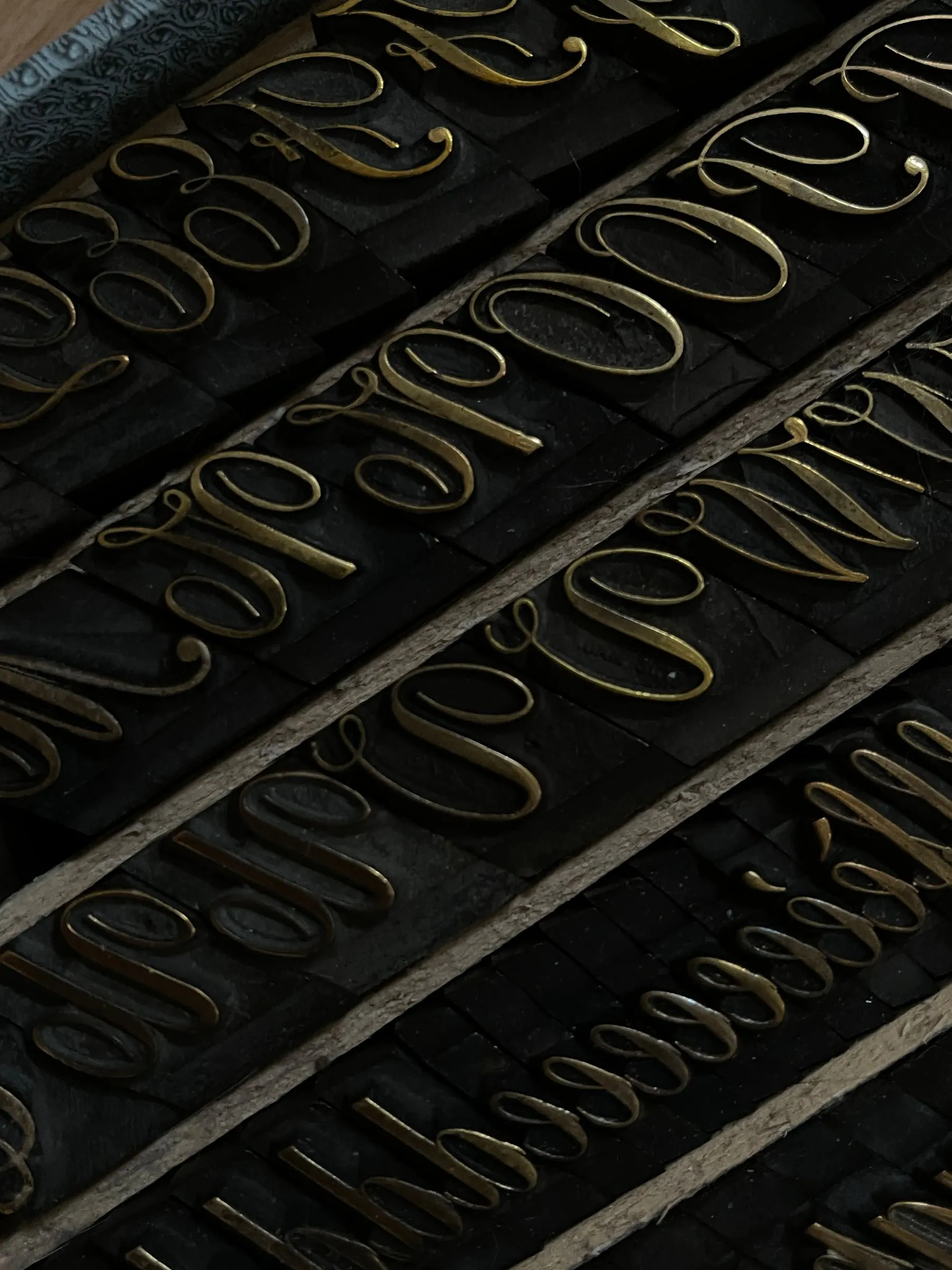
Mixfont introduced Decoy Font on 6 August 2026. The typeface keeps letter outlines sharp but places a blurred, shapeless mass behind each character. Human vision separates the two layers without effort and reads the line normally. A model working pixel by pixel does not separate them; it treats outline and blur as one form and resolves the wrong letter. The result behaves like two different texts sitting on the same surface.
The gap it exploits is the difference between contextual and pattern-based reading. People fill in damaged letters from context; machines match shapes first. That advantage is temporary by design. Any filter becomes training data once enough samples exist, and a model trained on this particular distortion stops failing. What matters is less the fix than the shift it marks: type design entering the copyright argument as a tool rather than a subject.
Credits and sources
Source
- Dezeen · 6 August 2026
This piece was written by 2C Magazine from the facts in the source above. No sentences were taken or translated from the source; the commentary is our own.
Image
Illustrative image · Photo: Eugenia Remark / Pexels — free licence
The image is not the subject’s own photograph; it was chosen from a free-licence archive to represent the topic. No image from the source publication was copied.
Copyright
Text © 2C Magazine, 2026. You may quote with attribution and a link; republishing in full requires permission.
hello@2cstd.com — notices are actioned within 48 hours.
Comments
Loading comments...